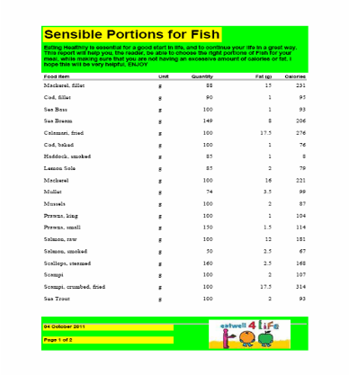
| One of the publications which needed to be created for the Unit 2, you can do it project was the eat well reports, which were designed to aid students in their eat well challenges, which aim to help students to improve their diets. One of the way it says to do this is to eat healthier foods. Therefore I produced a report of the popular and unpopular types of foods, of which these were determined by my questionnaire. To start with, I needed to create a report on Microsoft access 2003, which would allow me to have all the items which were meat, all which were cereal (and grain) and all which were fish, and put them in separate reports. After this was done I edited each report so that they were more aesthetically pleasing, so that the reader was less likely to look at it and not take notice, after all the audience of this is teenagers, who are prone to lack of attention, so i added colour to add interest. I also included an explanation of what each of these reports was meant to do, and the logo for eat well at the bottom (which has been recorded in my sources table). Their was a technical problem with the document which meant that some of the reports spills onto the next page, but is nothing major as this is only the descritive top and bottom. If i were to make this again I would make sure that this did not occur on my project |

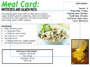
| One of our Publications we had to design and make a meal cards, which holds information on two courses, which are not in the survey results. It is to encourage children to try new things, so the ingredients I chose came from the food types which were the least popular in my survey, and the secondary data I collected from my peers. The recipes I chose were Watercress and Salmon Pasta, which includes cereal and grains, as well as fish, both of which were not popular in my survey, and for my dessert a Rice Pudding Surprise, which includes Cereal and grains. Both of these chosen recipes are very tasty, nutritious and fulfil the objective of the task. The information I put on the meal card included the name, a short description, ingredients, costs, times and skill level, and finally pictures of the ingredients and finished product images. For my first set of images i was given feedback that the images were unsuitable, so i followed up on this advice and redid them. |
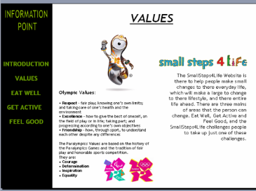
| For this publication, I had to produce an information point to introduce an Olympic value and the SmallSteps4Life programme. It also had to encourage students to take up a challenge. My information point would be run in the reception area of schools and colleges and Students wanting to watch it had to be able to select different screens using a mouse. To start with, I created a navigation bar at the side, which would allow to browse from page to page easily, and with a mouse. Next, I set about creating the Introduction, figuring that with a good base to start with the entire publication would go a lot smoother. All images and logos included in the project were added to my sources table, with a short write up, and the main information sources were also recorded, such as the Olympics and the SmallSteps4Life Website. After I finally created my five slides, and had hyper linked them all to the navigation bar, I converted it into a Power Point Show, saved it, and linked it to my e-portfolio |

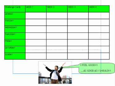
| One of the documents which needed to be produced was the Challenge Card, which is meant to encourage people to take part in a challenge under the topics eat well, feel good or get active. The card had to include boxes for four weeks, and a box for each day in each week, so that the user can record what they have done that day if anything to help fufill their challenge. I made the project in publisher 2003, and started off by creating suitable lines for name, age and home number, allowing contact to the person, and allowing a check on the persons age. I included all the neededs requirments listed on the DiDA website, and included a picture with a caption at the bottom, saying the words "I feel good, as good as i should" relating to the song. The colours i chose linked with the feel good logo at the top, choosing green throughout the entire documnet. If i were to make this again i dont think their is anything I would change |